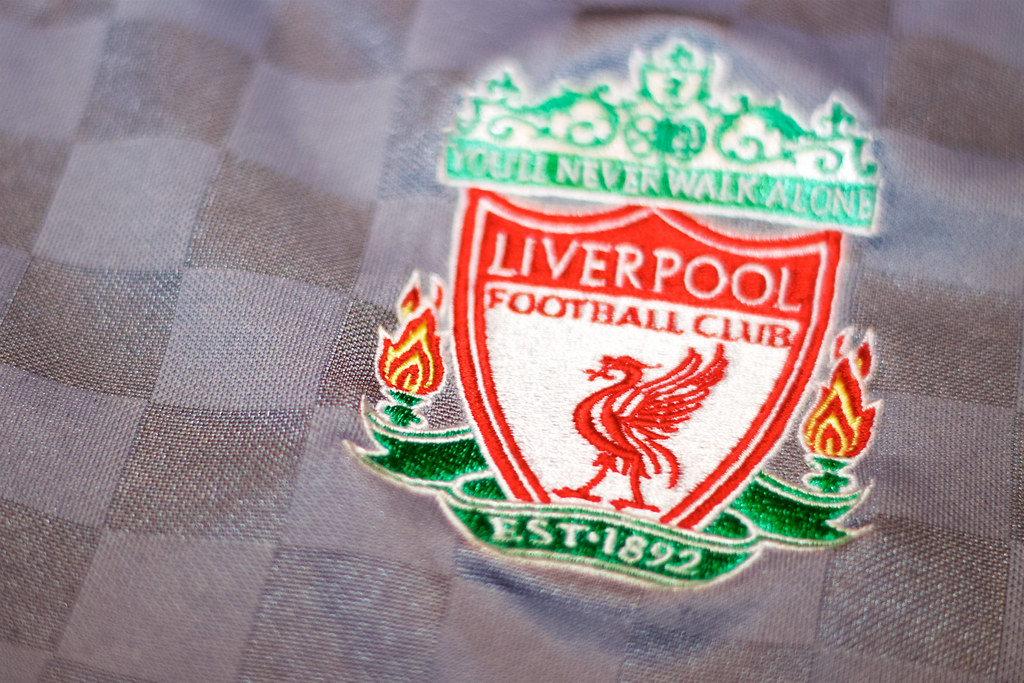
With Liverpool’s contract with New Balance expiring in the summer, the Reds are in line to strike a new kit deal with Nike ahead of the 20/21 season.
There is still the possibility of the club remaining with the Boston-based manufacturers, however, depending on the outcome of the High Court Battle.
But, instead of delving into the legalities of the situation, we’ve decided to look back over the years and highlight Liverpool’s best and worst kits of the Premier League era.
The Best
Goalkeeper Kit 19/20
Now, it might be debatable whether goalkeeper kits should be included in this, but the black and gold strip for this season is impossible to leave out.
Fans responded incredibly well when the kits were announced back in April and this has definitely been a favourite.
Black kits can be difficult to get right, but New Balance hit the jackpot this year.
Home Kit 04/06
This one is definitely memorable, as the kit Liverpool wore when they lifted the Champions League trophy for the fifth time in 2005.
Reebok have been one of the Reds’ better kit manufacturers, with a simple yet stylish design.
Combined with the famous ‘Carlsberg’ sponsorship, this strip is one of Liverpool’s most iconic.
Home Kit 08/10
When anyone thinks of Fernando Torres at Liverpool, they most likely picture him in this kit.
Long sleeves, headband and the small matter of 32 league goals over the two seasons this was the home strip.
Manufactured by Adidas, they more than made up for some horrific designs in the past with this classic.
Home Kit 17/18
This kit had a real retro vibe about it, largely down to the white ‘V’ neck.
Liverpool fans can also associate this kit with the season Mo Salah announced himself on the world stage, netting 32 league goals in a single season and breaking all sorts of records.
Home Kit 19/20
If this turns out to be Liverpool’s final season with New Balance, they really did go out with a bang.
This season’s strips are dedicated to the late Bob Paisley, with each shirt imprinted with his signature.
This kit is based off the 82/83 season, where Paisley led Liverpool to their 13th league title.
The iconic pinstripes, the round collar and shade of red make for a fantastic design and Liverpool fans will be hopeful this kit is remembered for a victorious season.
The Worst
Away Kit 95/96
Away kits will be a common theme among the worst kits of the Premier League era, starting with the 95/96 away strip.
Green can most definitely be done correctly, take Adidas’ green away kits from 91-95 as examples.
The ‘Adidas’ stripes on the sleeves clash with the green, the boxes of colour look dreadful – along with the Carlsberg logo looking like its’ been pasted on with the white background.
This really is one to forget.
Home Kit 06/08
Another blip in the road for Adidas. This one was awful.
Collars on football kits have to be done right, this one looks scruffy and ruins what could’ve been a very reasonable kit.
This was also the kit Liverpool wore in the 2007 Champions League Final in Athens, that saw AC Milan inflict revenge for their 2005 defeat.
Maybe another reason Reds’ fans would want to forget this one.
Third Kit 08/09
Oh look, another dreadful looking collar and questionable shade of green.
Adidas maybe didn’t quite learn from their mistakes from 06-08, but at least this was a third kit rather than home strip.
Thankfully this wasn’t worn all that often and the home kit at the time more than made up for it.
Third Kit 12/13
When ‘horrible kits’ is mentioned, this one immediately springs to mind.
The 12/13 third kit was a strange one that thankfully only once saw the light of day in the League, although it was part of horrible set of strips that year for Warrior.
Regarded on Merseyside as the ‘wheelie bin kit’ due to bins being purple in Liverpool, this really was one of the worst.
Third Kit 13/14
Another strange combination of colours in a Liverpool third kit, a common theme for Warrior.
The Reds’ 13/14 season was a positive one, a second-placed finish, over 100 goals – but this kit most definitely wasn’t part of that.
There is way too much going on, but at least it can make opponents dizzy, right?
Date Written: October 18th 2019 | Part of university work
